跳至內容
amagicsoft 標誌圖示
  • 首頁
  • 產品
    • Magic Data Recovery
    • Magic Recovery Key
  • 商店
  • 部落格
  • 更多資訊
    • 關於 Amagicsoft
    • 聯絡我們
    • 隱私權政策
    • 條款
    • 許可協議
    • 退款政策
  • 繁體中文
    • English
    • 日本語
    • 한국어
    • Deutsch
    • Français
維基

資料可視化

2025 年 11 月 30 日 艾迪 在〈Data Visualization〉中留言功能已關閉
資料可視化

目錄

Turning Raw Data Into Visual Insight

Spreadsheets full of numbers rarely tell a clear story at a glance.
Teams want to see trends, exceptions, and relationships without reading thousands of rows.

Data visualization solves that need.
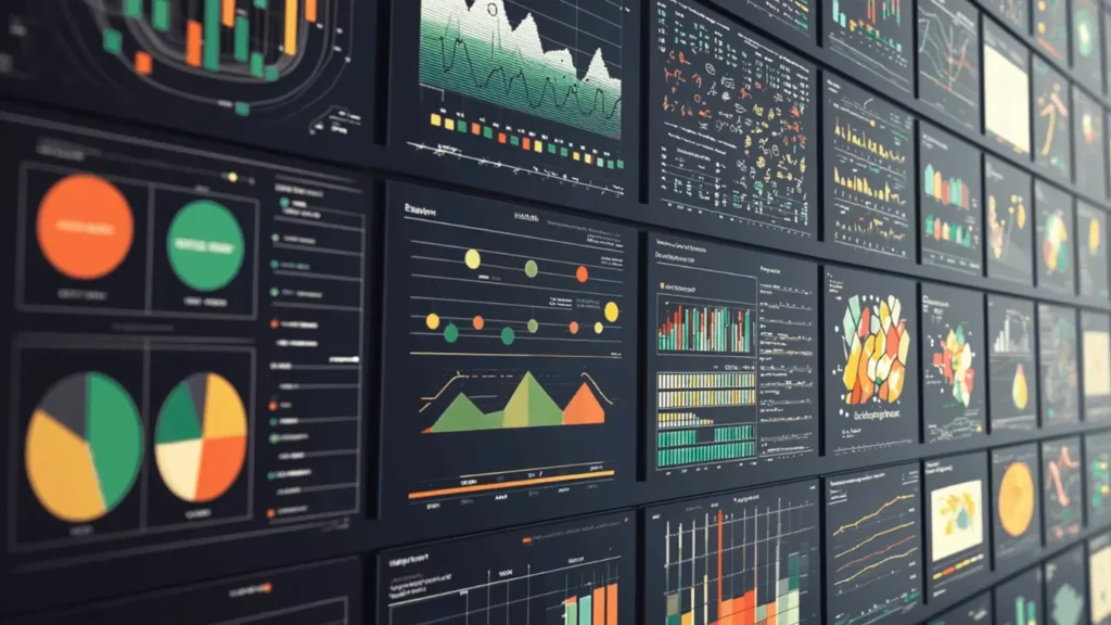
It encodes values as shapes, positions, lengths, and colors so patterns become obvious, and important anomalies stand out immediately.

what is Data Visualization

 Building Blocks of a Useful Visualization

Effective visuals combine three elements: data, visual encodings, and context.

Typical encodings include:

  • Position on an axis (strong for comparing values)

  • Length and area (bars and columns)

  • Color hue or intensity (categories or density)

  • Shape and size (groups or emphasis)

Context comes from titles, labels, units, and notes.
Clear context lets viewers understand exactly what each mark on the chart represents.

Data Visualization in an Analytical Workflow

Visualization does not stand alone.
It fits into a broader analysis pipeline that turns raw sources into decisions.

A common workflow looks like this:

  1. Collect and profile data from databases, logs, files, or APIs.

  2. Clean and transform fields, handle missing values, and create calculated metrics.

  3. Choose visual forms that match the questions and data types.

  4. Iterate with stakeholders, refining focus, filters, and annotations.

  5. Publish or embed dashboards and reports where people work every day.

Each step affects the clarity and reliability of the final charts.

Matching Visual Forms to Questions

Different questions call for different chart types.
Choosing an appropriate form matters as much as the data itself.

Common families:

  • 比較: bar charts, column charts, grouped bars

  • Trend: line charts, area charts, sparklines

  • Distribution: histograms, box plots, violin plots

  • Relationship: scatter plots, bubble charts, correlation matrices

  • Composition: stacked bars, 100% stacked bars, waterfall charts

Maps, heatmaps, and network diagrams extend these ideas into space and relationships when location or connectivity matters.

Practical Design Guidelines for Clear Charts

Clean design helps viewers understand visuals quickly.
A few disciplined habits make a big difference.

建議的做法:

  • Use simple, legible fonts and avoid decorative effects.

  • Limit color palettes; reserve bright colors for emphasis.

  • Start axes at zero when you compare magnitudes with bars.

  • Avoid 3D effects that distort perception.

  • Label directly where possible instead of relying only on legends.

Every extra element should justify its presence by adding clarity, not decoration.

Visualizing Storage and Recovery Metrics

在 資料復原 and system maintenance, visualization helps teams monitor risks and results.
Instead of scanning log files, they see patterns directly.

Examples that benefit from charts:

  • Counts of failed versus successful recovery jobs by day

  • Distribution of file types recovered from damaged volumes

  • SMART attributes from disks over time (temperature, reallocated sectors)

  • Trend lines of remaining free space on backup targets

By exporting logs from tools such as Amagicsoft 資料復原 into Excel or BI platforms, technicians can build dashboards that reveal early warnings before data loss grows severe.

Simple Visualization Workflow With Common Tools

Many teams start with tools they already know: spreadsheets and basic BI.

A practical approach:

  1. Export recovery logs, drive inventories, or performance metrics to CSV.

  2. Load the file into Excel, Power BI, or another visualization tool.

  3. Create pivot tables that summarize recovery counts, sizes, or error types.

  4. Turn those summaries into charts or small dashboards.

  5. Share updated files or publish reports on an internal portal.

支援 Windows 7/8/10/11 和 Windows Server。.

總結

Data visualization turns abstract tables into interpretable scenes.
Good charts highlight trends, clusters, and anomalies so teams react quickly and confidently.

In technical domains such as storage management and 資料復原, visuals give clear evidence of risk and progress.
Combined with reliable tools like Amagicsoft 資料復原, they help organizations move from raw logs to informed, traceable decisions.

下載 Magic Data Recovery

支援 Windows 7/8/10/11 和 Windows Server


常見問題


What is meant by data visualizatio

Data visualization refers to the practice of representing data as charts, graphs, maps, and other visual forms. By encoding numbers as shapes, positions, and colors, it turns raw tables into patterns humans understand quickly. Analysts use visualization to explore data, explain findings, and support informed, evidence-based decisions.

What do you mean by data visualizer?

A data visualizer designs and builds visual representations of information. The role may sit inside analytics, product, or design teams. This person selects chart types, defines encodings, chooses color schemes, and works with stakeholders to ensure the visuals remain accurate, readable, and aligned with the questions that matter.

What are the 5 steps in data visualization?

A five-step sequence often works well. First, clarify the question and audience. Second, gather and clean the data. Third, select appropriate chart types and encodings. Fourth, design and iterate to improve clarity. Fifth, publish and monitor how people use the visual so you can refine it over time.

What are the four types of data visualization?

Many frameworks group visualizations into four broad categories. These include comparison charts, trend or time-series visuals, distribution plots, and relationship diagrams. Each group answers a different type of question, so choosing the correct family matters as much as choosing any specific chart within it.

What are the 5 C's of data visualization?

Teams often summarize good practice with five C’s. Common versions include clear, concise, credible, consistent, and compelling. Clear visuals avoid clutter, concise visuals focus on essentials, credible visuals reflect accurate data, consistent visuals align styles across reports, and compelling visuals drive the viewer toward an informed decision or action.

Can ChatGPT do data visualization?

ChatGPT can help design and explain visualizations, and it can generate code for tools such as Python, Excel, or BI platforms. It can suggest chart types, write transformation logic, or draft dashboard layouts. Rendering actual interactive visuals requires external software, but AI speeds up the planning and implementation steps.

What are the 3 C's of data visualization?

Some teams use a shorter rule: context, clarity, and choice. Context sets the stage with labels, units, and explanations. Clarity reduces visual noise and highlights key patterns. Choice refers to selecting the right chart type and encodings so the graphic matches the data structure and the question.

Is SQL for data visualization?

SQL focuses on querying and transforming data in relational databases. It filters, aggregates, and joins tables so visualization tools receive clean input. You typically use SQL to prepare datasets, then send the results into tools such as Excel, Power BI, or Python libraries that generate the actual charts and dashboards.

Is data visualization a hard skill?

Data visualization mixes hard and soft skills. On the technical side, it requires knowledge of chart types, encodings, and supporting tools. On the communication side, it demands a sense for narrative, emphasis, and audience needs. With deliberate practice, many analysts develop it as a repeatable, teachable capability.
  • WiKi
艾迪

Eddie 是一位 IT 專家,在電腦行業的幾家知名公司擁有超過 10 年的工作經驗。他為每個專案帶來深厚的技術知識和實際的問題解決技巧。.

文章導覽

上一頁
下一頁

搜尋

類別

  • Bitlocker 復原
  • 刪除的檔案復原
  • 格式化檔案復原
  • 硬碟復原
  • 授權金鑰復原
  • 遺失檔案復原
  • 記憶卡復原
  • 新聞
  • 照片復原
  • SSD 復原
  • 未分類
  • USB 磁碟機復原
  • 使用者指南
  • 維基

最近發表的文章

  • SSD 作為外接式硬碟機的優缺點
    SSD 作為外接式硬碟機的優缺點
  • 如何在 Mac 電腦上使用目標磁碟模式和共用模式
    如何在 Mac 電腦上使用「目標磁碟模式」和「共用模式」:完整指南
  • 重複檔案搜尋器
    重複檔案搜尋器

標籤

如何 Magic Data Recovery Magic Recovery Key WiKi

相關文章

重複檔案搜尋器
維基

重複檔案搜尋器

2025 年 12 月 02 日 艾迪 尚未有評論

目錄 重複檔案並非真正的備份 許多使用者將文件拖曳到新的資料夾或外接式磁碟機,以保留「額外安全」的文件副本。重複檔案會浪費儲存空間、減慢備份速度,並使資料復原變得更加混亂。重複檔案搜尋器可協助您找出多餘的副本,因此 [...]

情境切換
維基

情境切換

2025 年 12 月 02 日 艾迪 尚未有評論

只有少數 CPU 核心存在,因此大多數線程會在佇列中等待,只有一小部分會執行。上下文切換可讓調度程序暫停一個執行中的線程,並恢復另一個線程。這種快速切換會造成平行的假象 [...] 。

資料擷取
維基

資料擷取

2025 年 12 月 02 日 艾迪 尚未有評論

目錄 事故現場:資料蒐集前的風險 當事件發生時,第一個反應通常是「四處查看」即時系統。在任何人記錄乾淨狀態之前,未經計劃的點擊、根登入或檔案複製都可能會改變時間戳記、日誌和未配置的空間。資料擷取可以解決這個問題。它著重於在受控制的 [...] 環境中蒐集資料。

amagicsoft 標誌圖示

我們的願景是成為全球知名的軟體品牌和服務供應商,為使用者提供頂級的產品和服務。

產品
  • Magic Data Recovery
  • Magic Recovery Key
政策
  • 條款
  • 隱私權政策
  • 退款政策
  • 許可協議
公司簡介
  • 關於 Amagicsoft
  • 聯絡我們
  • 商店
追蹤我們

版權所有 © 2025 Amagicsoft。版權所有。

  • 條款
  • 隱私權政策