Zum Inhalt springen
amagicsoft Logo-Symbol
  • Startseite
  • Produkte
    • Magic Data Recovery
    • Magic Recovery Key
  • Laden Sie
  • Blog
  • Mehr
    • Über Amagicsoft
    • Kontakt US
    • Datenschutzbestimmungen
    • Bedingungen
    • Lizenzvereinbarung
    • Erstattungspolitik
  • Deutsch
    • English
    • 日本語
    • 한국어
    • Français
    • 繁體中文
Wiki

Datenvisualisierung

30. November 2025 Eddie Kommentare deaktiviert für Data Visualization
Datenvisualisierung

Inhaltsübersicht

Turning Raw Data Into Visual Insight

Spreadsheets full of numbers rarely tell a clear story at a glance.
Teams want to see trends, exceptions, and relationships without reading thousands of rows.

Data visualization solves that need.
It encodes values as shapes, positions, lengths, and colors so patterns become obvious, and important anomalies stand out immediately.

what is Data Visualization

 Building Blocks of a Useful Visualization

Effective visuals combine three elements: data, visual encodings, and context.

Typical encodings include:

  • Position on an axis (strong for comparing values)

  • Length and area (bars and columns)

  • Color hue or intensity (categories or density)

  • Shape and size (groups or emphasis)

Context comes from titles, labels, units, and notes.
Clear context lets viewers understand exactly what each mark on the chart represents.

Data Visualization in an Analytical Workflow

Visualization does not stand alone.
It fits into a broader analysis pipeline that turns raw sources into decisions.

A common workflow looks like this:

  1. Collect and profile data from databases, logs, files, or APIs.

  2. Clean and transform fields, handle missing values, and create calculated metrics.

  3. Choose visual forms that match the questions and data types.

  4. Iterate with stakeholders, refining focus, filters, and annotations.

  5. Publish or embed dashboards and reports where people work every day.

Each step affects the clarity and reliability of the final charts.

Matching Visual Forms to Questions

Different questions call for different chart types.
Choosing an appropriate form matters as much as the data itself.

Common families:

  • Vergleich: bar charts, column charts, grouped bars

  • Trend: line charts, area charts, sparklines

  • Distribution: histograms, box plots, violin plots

  • Relationship: scatter plots, bubble charts, correlation matrices

  • Composition: stacked bars, 100% stacked bars, waterfall charts

Maps, heatmaps, and network diagrams extend these ideas into space and relationships when location or connectivity matters.

Practical Design Guidelines for Clear Charts

Clean design helps viewers understand visuals quickly.
A few disciplined habits make a big difference.

Empfohlene Praktiken:

  • Use simple, legible fonts and avoid decorative effects.

  • Limit color palettes; reserve bright colors for emphasis.

  • Start axes at zero when you compare magnitudes with bars.

  • Avoid 3D effects that distort perception.

  • Label directly where possible instead of relying only on legends.

Every extra element should justify its presence by adding clarity, not decoration.

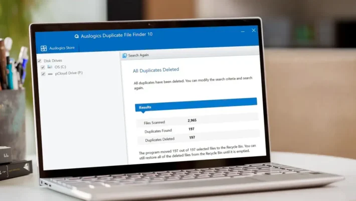
Visualizing Storage and Recovery Metrics

Unter Datenwiederherstellung and system maintenance, visualization helps teams monitor risks and results.
Instead of scanning log files, they see patterns directly.

Examples that benefit from charts:

  • Counts of failed versus successful recovery jobs by day

  • Distribution of file types recovered from damaged volumes

  • SMART attributes from disks over time (temperature, reallocated sectors)

  • Trend lines of remaining free space on backup targets

By exporting logs from tools such as Amagicsoft Datenrettung into Excel or BI platforms, technicians can build dashboards that reveal early warnings before data loss grows severe.

Simple Visualization Workflow With Common Tools

Many teams start with tools they already know: spreadsheets and basic BI.

A practical approach:

  1. Export recovery logs, drive inventories, or performance metrics to CSV.

  2. Load the file into Excel, Power BI, or another visualization tool.

  3. Create pivot tables that summarize recovery counts, sizes, or error types.

  4. Turn those summaries into charts or small dashboards.

  5. Share updated files or publish reports on an internal portal.

Unterstützt Windows 7/8/10/11 und Windows Server.

Schlussfolgerung

Data visualization turns abstract tables into interpretable scenes.
Good charts highlight trends, clusters, and anomalies so teams react quickly and confidently.

In technical domains such as storage management and Datenwiederherstellung, visuals give clear evidence of risk and progress.
Combined with reliable tools like Amagicsoft Datenrettung, they help organizations move from raw logs to informed, traceable decisions.

Herunterladen Magic Data Recovery

Unterstützt Windows 7/8/10/11 und Windows Server


Häufig gestellte Fragen


What is meant by data visualizatio

Data visualization refers to the practice of representing data as charts, graphs, maps, and other visual forms. By encoding numbers as shapes, positions, and colors, it turns raw tables into patterns humans understand quickly. Analysts use visualization to explore data, explain findings, and support informed, evidence-based decisions.

What do you mean by data visualizer?

A data visualizer designs and builds visual representations of information. The role may sit inside analytics, product, or design teams. This person selects chart types, defines encodings, chooses color schemes, and works with stakeholders to ensure the visuals remain accurate, readable, and aligned with the questions that matter.

What are the 5 steps in data visualization?

A five-step sequence often works well. First, clarify the question and audience. Second, gather and clean the data. Third, select appropriate chart types and encodings. Fourth, design and iterate to improve clarity. Fifth, publish and monitor how people use the visual so you can refine it over time.

What are the four types of data visualization?

Many frameworks group visualizations into four broad categories. These include comparison charts, trend or time-series visuals, distribution plots, and relationship diagrams. Each group answers a different type of question, so choosing the correct family matters as much as choosing any specific chart within it.

What are the 5 C's of data visualization?

Teams often summarize good practice with five C’s. Common versions include clear, concise, credible, consistent, and compelling. Clear visuals avoid clutter, concise visuals focus on essentials, credible visuals reflect accurate data, consistent visuals align styles across reports, and compelling visuals drive the viewer toward an informed decision or action.

Can ChatGPT do data visualization?

ChatGPT can help design and explain visualizations, and it can generate code for tools such as Python, Excel, or BI platforms. It can suggest chart types, write transformation logic, or draft dashboard layouts. Rendering actual interactive visuals requires external software, but AI speeds up the planning and implementation steps.

What are the 3 C's of data visualization?

Some teams use a shorter rule: context, clarity, and choice. Context sets the stage with labels, units, and explanations. Clarity reduces visual noise and highlights key patterns. Choice refers to selecting the right chart type and encodings so the graphic matches the data structure and the question.

Is SQL for data visualization?

SQL focuses on querying and transforming data in relational databases. It filters, aggregates, and joins tables so visualization tools receive clean input. You typically use SQL to prepare datasets, then send the results into tools such as Excel, Power BI, or Python libraries that generate the actual charts and dashboards.

Is data visualization a hard skill?

Data visualization mixes hard and soft skills. On the technical side, it requires knowledge of chart types, encodings, and supporting tools. On the communication side, it demands a sense for narrative, emphasis, and audience needs. With deliberate practice, many analysts develop it as a repeatable, teachable capability.
  • WiKi
Eddie

Eddie ist ein IT-Spezialist mit mehr als 10 Jahren Erfahrung, die er bei mehreren bekannten Unternehmen der Computerbranche gesammelt hat. Er bringt tiefgreifende technische Kenntnisse und praktische Problemlösungsfähigkeiten in jedes Projekt ein.

Beitrags-Navigation

Vorherige
Weiter

Suche

Kategorien

  • Bitlocker-Wiederherstellung
  • Wiederherstellung gelöschter Dateien
  • Formatieren der Dateiwiederherstellung
  • Festplattenwiederherstellung
  • Lizenzschlüssel-Wiederherstellung
  • Wiederherstellung verlorener Dateien
  • Wiederherstellung von Speicherkarten
  • Nachrichten
  • Foto-Wiederherstellung
  • SSD-Wiederherstellung
  • Uncategorized
  • USB-Laufwerk-Wiederherstellung
  • Benutzerhandbuch
  • Wiki

Neueste Beiträge

  • Die Vor- und Nachteile von SSDs als externe Festplattenlaufwerke
    Die Vor- und Nachteile von SSDs als externe Festplattenlaufwerke
  • Verwendung des Zieldatenträgermodus und des Freigabemodus auf Mac-Computern
    Verwendung des Zieldatenträgermodus und des Freigabemodus auf Mac-Computern: Eine vollständige Anleitung
  • Duplikat-Finder
    Duplikat-Finder

Tags

Wie man Magic Data Recovery Magic Recovery Key WiKi

Verwandte Beiträge

Duplikat-Finder
Wiki

Duplikat-Finder

2. Dezember 2025 Eddie Noch keine Kommentare

Inhaltsverzeichnis Doppelte Dateien sind keine echten Backups Viele Benutzer legen “zusätzliche Sicherheitskopien” von Dokumenten an, indem sie sie in neue Ordner oder auf externe Laufwerke ziehen, die sich mit der Zeit vervielfältigen und eher zu einem Durcheinander als zu einem Schutz werden. Doppelte Dateien verschwenden Speicherplatz, verlangsamen Backups und machen die Datenwiederherstellung unübersichtlich.Ein Duplicate File Finder hilft, redundante Kopien zu identifizieren, so [...]

Kontextwechsel
Wiki

Kontextwechsel

2. Dezember 2025 Eddie Noch keine Kommentare

Inhaltsverzeichnis CPU-Zeit als gemeinsam genutzte Ressource Moderne Betriebssysteme jonglieren mit Dutzenden oder Hunderten aktiver Threads. Da nur wenige CPU-Kerne vorhanden sind, warten die meisten Threads in Warteschlangen, während eine kleine Teilmenge läuft. Ein Kontextwechsel ermöglicht es dem Scheduler, einen laufenden Thread anzuhalten und einen anderen fortzusetzen. Dieser schnelle Wechsel erzeugt die Illusion von Parallelität [...]

Datenerfassung
Wiki

Datenerfassung

2. Dezember 2025 Eddie Noch keine Kommentare

Inhaltsverzeichnis Schauplatz eines Vorfalls: Vor der Datenerfassung gefährdete Daten Wenn ein Vorfall eintritt, besteht der erste Instinkt oft darin, sich im Live-System “umzusehen”. Ungeplante Klicks, Root-Logins oder Dateikopien können Zeitstempel, Protokolle und nicht zugewiesenen Speicherplatz verändern, bevor jemand einen sauberen Zustand erfasst. Die Datenerfassung löst dieses Problem und konzentriert sich auf die Sammlung von Daten in einem kontrollierten [...]

amagicsoft Logo-Symbol

Unsere Vision ist es, eine weltweit bekannte Softwaremarke und ein Dienstleistungsanbieter zu werden, der seinen Nutzern erstklassige Produkte und Dienstleistungen anbietet.

Produkte
  • Magic Data Recovery
  • Magic Recovery Key
Politik
  • Bedingungen
  • Datenschutzbestimmungen
  • Erstattungspolitik
  • Lizenzvereinbarung
Unternehmen
  • Über Amagicsoft
  • Kontakt US
  • Laden Sie
Folgen Sie uns

Urheberrecht © 2025 Amagicsoft. Alle Rechte vorbehalten.

  • Bedingungen
  • Datenschutzbestimmungen